

The Opportunity: Make Lists Easier to Create & Share
BiblioCommons wanted to iterate on their Lists feature, which are important for generating user-generated content and engagement on their platform. Lists allow BiblioCommons’ primary user groups – library staff and patrons – the ability to self-publish lists of recommendations sourced from library’s catalogue (which can be visible to up to eight million registered users across the BiblioCommons platform). Offering recommendations is an important aspect of a library’s website content and Lists give every BiblioCommons user a chance to share their passions and expertise.
As the UX Design lead on the project, I was responsible for helping the team make improvements to the Beta release of the design, with the goal of making it easier for staff and patrons to curate and share their lists. In order to accomplish this, the Beta version had been released to library staff so we could gather feedback before proceeding. Analytics and user feedback was used to inform the design deliverables, which included a “proto-flow”, wireframes, design mockups and specs for various device sizes.
The Challenge
Feedback data, heuristic analysis and strategic goals presented the classic product problem: a huge list of potential feature improvements with a limited amount of time and resources to design and develop. Legacy software storage and migration concerns amplified these constraints.
The feedback from the Beta version (and ux research on Shelves, another feature on the BiblioCommons platform) revealed the unique needs of staff and patrons around why they wanted to create and share Lists. For business reasons, it was important to ensure that Lists primary function would focus on creating and sharing content (rather than as personal record-keeping tool).
Using Research to Inform Design & Product Decisions
Given the time constraints, it was crucial to be resourceful about discovering insights that would validate the next iteration. Since the Beta had been released to library staff, their feedback was a key source of data which helped to validate the product updates. While this feedback was helpful, it could also at times be contradictory, text heavy and/or opaque. I tagged and sorted the feedback so the magnitude, sentiment and severity of it could be measured and reported. We also had the BiblioCommons data engineer scrape analytics data so we could assess the popularity of different list types and compare usage amongst different user segments. Feedback was then supplemented with stakeholder interviews, that allowed us to dig more deeply into List makers needs and concerns.
Ultimately, there was a mixture of positive and extremely troubling feedback, which generally supported the findings from the heuristic analysis I had completed. It showed that there were issues around the new publishing model, which introduced the concept of a Draft state, but the confusing labeling and workflow was causing list makers to lose their work if they navigated away from the page before “publishing”.
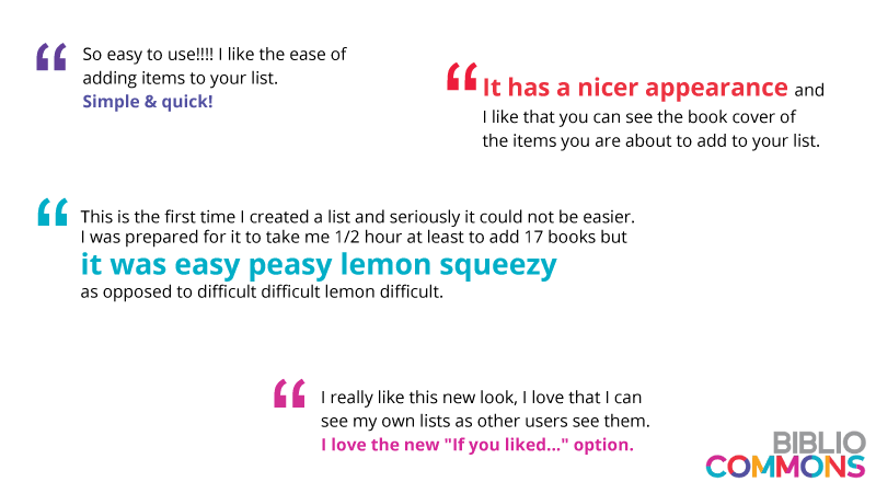
As a UX Designer, hearing negative feedback can keep you up at night! Fortunately, there was also some very positive feedback:
Exploring Features and Goals
Given the multitude of potential feature ideas and the ambitious number of strategic goals, I suggested we do some affinity mapping so we could learn how the potential improvements aligned with the strategic objectives. The three main goals were to encourage quality list curation, make lists easier to discover and to increase circulation.
Mapping objectives within a Venn Diagram produced clusters in the areas where the goals overlapped, allowing us to effectively visualize and discuss which features had higher business value. The clustered set of features gave the product manager a new perspective and a streamlined list of high-value feature improvements, which could then be assessed for technical feasibility (which if done too soon, can often deflate an ideation session).

Above: I led a whiteboarding exercise using a Venn Diagram to map features to goals, making it easier to visualize high-value improvements.
Design Recommendations
To get buy-in and help the product team visualize the scope of the design requirements, I introduced a new design deliverable that I coined a “proto-flow”. This was an interactive user flow (which I created using Sketch and InVision) that allowed the team to visualize and interact with the various workflows and screens.
As the project moved forward, I updated the proto-flow, so it evolved from annotated screenshots to wireframes and eventually, clickable design mockups. This helped the product team track the progress and functionality of each page, as well as define the scope and identify any content gaps. I captured more opportunities and suggestions in a Confluence document.

Above: This user flow captures the changes to the draft & publish workflow for the new “If You Liked…” list type. On the surface, it looks like a typical user flow, but the actual deliverable is an interactive “proto-flow” (created using Sketch and InVision).
The project’s scope was primarily focused on making improvements to the “List editor”, which is the page where users construct and edit a List. In order to prevent user’s from experiencing catastrophic data loss and minimize their effort and confusion, we introduced autosave feature that automatically stored a Draft version. We also sought to address privacy concerns and make the visibility workflow more explicit by asking people to select their audience (eg ranging from “only me” to “everyone”) after they’re “finished editing”.
The toolbar is a key element of the list editor page as it contains buttons for adding and publishing, as well as access to settings.

Above: Toolbar (beta version) BEFORE the redesign. Heuristic analysis and feedback showed that the List editor’s “tool bar” was confusing list makers with unclear labels and a confusing publishing workflow, causing them to lose their work.

Above: The toolbar AFTER incorporating feedback (current iteration). In this example, the list editor’s toolbar is less cluttered with confusing actions (such as “unpublish”) and includes the new autosave status update. Button labels were changed to reflect the new and improved Draft and Publishing workflow.
Other changes to the editor involved reducing friction for adding and reordering list items, including adding accessible controls for those using assistive devices. Improvements were also made to the List creation workflow by adding helpful and contextual content and by making relevant FAQ content easier to find. Finally, we created a moment of delight by making jacket (and/or album) covers appear when people publish their List. This burst of colour also helped people conceptually distinguish between the draft and published state.

Above: A “blue sky” wireframe showing the authenticated and populated My Lists page. The My Lists page is available on every BiblioCommons user profile and allows list makers to manage, display and share their lists with the BiblioCommons community.
Although not every feature idea or UX recommendation was possible to implement, this iteration of lists resulted in a lot of very happy List makers. This was especially true for the library staff who use lists as a staple of their website content.
To learn more about the various changes we made, check out the BiblioCommons webinar on List improvements that we presented to Library Staff. If you’d like to see Lists in action, have a look at this one on the Chicago Public Library website.
To learn more about the technical implementation and evolution of the jacket cover design, check out the BiblioCommons’ blog article, Collages in the Cloud.